Hike
Dashboard
The Hike Dashboard was designed to simplify how employees access everything they need at work. From payslips and leave requests to policies, benefits, and company updates. It serves as a single, connected hub that reduces tool-hopping, saves time, and keeps employees informed and empowered through a clear, consistent, and accessible interface.
Client
Hike
Deliverables
Dashboard Design
UI UX
Year
2025
Role
UX Designer and
Researcher

The Challenge
Employees, managers, and HR/IT spend excessive time searching across tools, emails, and chats to find policies, benefits, and the right action portals (pay, leave, expenses, IT). Information is duplicated or outdated, updates are missed, and support teams handle repetitive “where’s the link?” questions. This fragmentation reduces productivity, erodes trust in information, and increases operational load.

The Goal
Build a central employee hub that helps people quickly find and complete routine tasks like viewing payslips, submitting expenses, or checking policies without confusion or tool hopping.
The hub should offer:
• Quick task shortcuts on the home page and clear navigation
• Verified links to all key systems such as Pay, Leave, IT, and Performance • Smart search that understands natural terms and typos
• Simple, easy-to-read policies and benefits
• Accessible (WCAG AA) design so everyone can use it confidently
Success means: Employees find what they need in under 30 seconds, reach the right page within 3 clicks, HR or IT link queries drop by 30%, and user satisfaction scores stay above 80.
Interviews &
Persona
Objective: We learned how people actually find info and complete routine tasks (payslip, leave, expenses, policies, benefits), and where they got stuck.
Participants: 12 total: 6 employees (mix of tenures), 3 managers, 3 HR/IT stakeholders.
Method: We ran 20–25 min, remote, semi-structured interviews. Sessions were recorded and transcribed; we coded notes thematically.
Bias controls: We used neutral wording, asked about the last time they did a task, avoided product names, randomized question order, and included participants with varied roles/tenure and one keyboard-only user.
Employees (ICs)

Managers
HR/IT Stakeholders


Key Insights
Through our research, we discovered key patterns in how employees interact with company tools and information. These insights helped us understand their real challenges and design a dashboard that simplifies access, builds trust, and creates a more meaningful everyday experience.
1. Clarity
⚠️ PROBLEM
💡INSIGHT
Employees can’t find info quickly because it’s spread across tools
People don’t need more information, they need one clear place to begin every task
🔎 DESIGN FOCUS
A unified home hub that surfaces key actions upfront
2. Consistency
⚠️ PROBLEM
💡INSIGHT
Updates are shared through emails, chats, and different tools
When updates come from one channel and follow the same format, people trust them and act faster
🔎 DESIGN FOCUS
Use one source and a uniform layout for all company updates
3. Efficiency
⚠️ PROBLEM
💡INSIGHT
Simple things like leaves or expenses take too long
Most time is wasted jumping between portals, not doing the task
🔎 DESIGN FOCUS
Add quick links for daily tasks to save time
4. Empowerment
⚠️ PROBLEM
💡INSIGHT
Employees ask HR/IT for small things they could do themselves
People feel capable when they can find and finish tasks on their own
🔎 DESIGN FOCUS
Make search and actions simple enough to self-solve
User Journey Map
Next, we created a user journey map to trace the key stages an employee goes through while completing daily HR or IT tasks such as checking payslips, applying for leave, or finding policies.
The goal was to understand their emotions, pain points, and decision moments when navigating across multiple tools and identify how a unified dashboard could simplify that experience.
Information
Architecture
The information architecture was designed to organize all employee needs into clear, easy-to-navigate sections. Each tab connects to key actions like policies, benefits, tools, and updates, bringing everything employees use into one structured dashboard.

Storyboard &
Wireframes
Visualizing the app’s structure to ensure an intuitive and user-friendly experience before diving into design details.
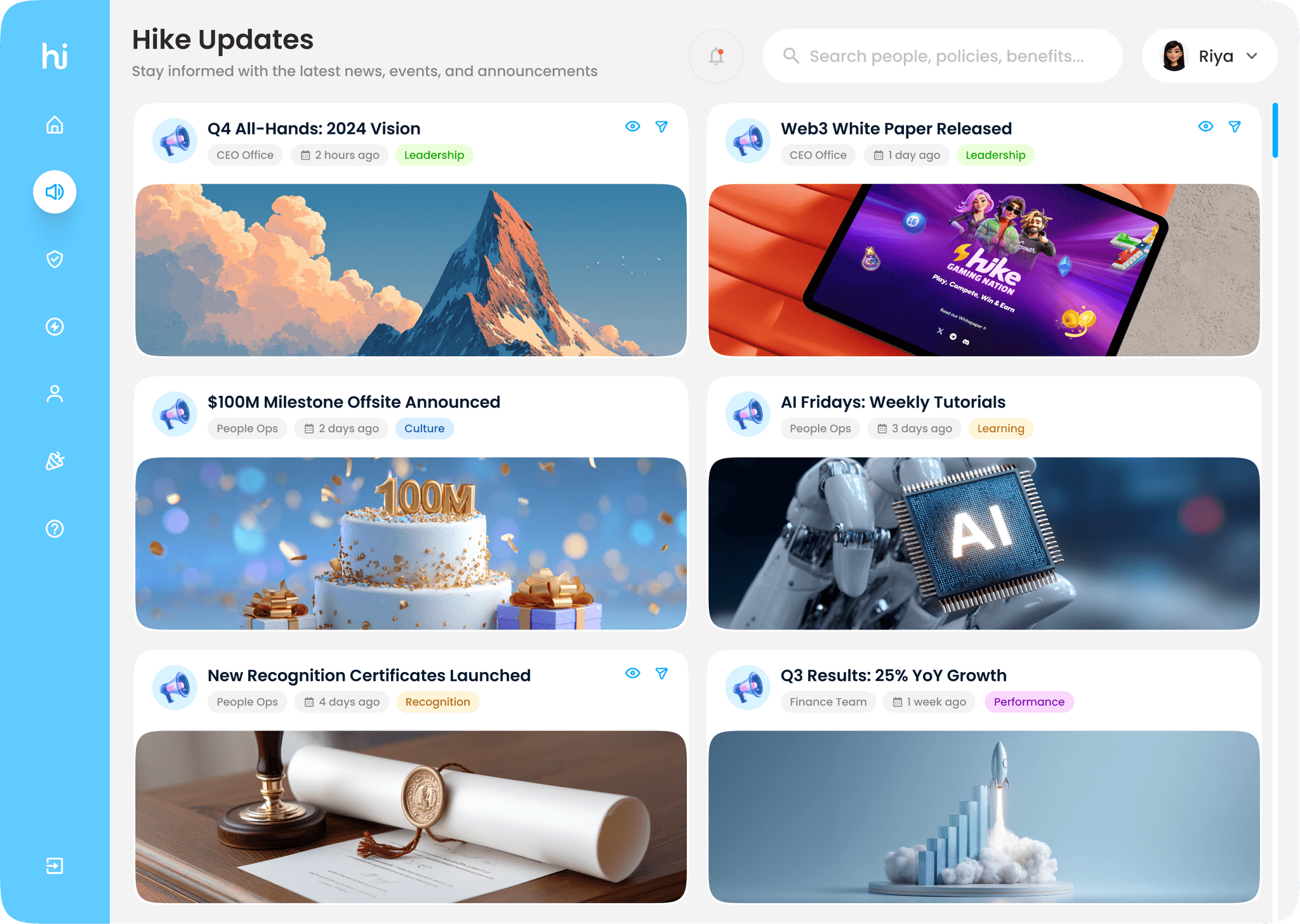
Final Screens
The final interface brings all key employee needs into one simple, unified experience. The Home screen acts as a quick launchpad for everyday tasks, while Hike Updates keeps everyone informed with the latest news and announcements. Policies and Benefits & Perks make information easy to find and understand, helping employees access the right documents and claims effortlessly. The People section connects teams through a clean, searchable directory. Together, these screens create a seamless, task-first workspace that’s consistent, accessible, and built for clarity and efficiency.


Prototype
An interactive prototype was created to showcase the user flow and demonstrate how employees can easily navigate tasks across the dashboard.
Key metrics &
Impact
The Hike Dashboard reimagines how employees interact with company tools by bringing everything into one clear, consistent space. From daily tasks to company updates, the experience is now faster, simpler, and more intuitive. Reducing confusion and helping people focus on their work, not on finding links.


Hi there 👋
Unlock the hidden treasure
on the big screen🖥️
Mobile’s still getting a makeover 🚧
Catch the magic on desktop ✨